Live-action role-players ("LARPers") are the nerds even nerds make fun of. Not content to sit around a table, roll dice, and play a standard RPG, they use the real world as their game board and turn the gameplay into a kind of improvisational theater with rules and foam weapons. On the surface, the mixture of inherent silliness and grandiose posturing makes this an easy hobby to snicker at and dismiss. But for anyone serious about gaming, and interested in the way humans build microcultures and create fantasy worlds, it raises a number of interesting questions.
When the 2006 documentary Darkon popped up on Netflix streaming, I thought it would be an easy opportunity for some cheaps laughs at the expense of the Geek-American community, of which I am a proud member. Darkon won several awards and is certainly a technically accomplished feature-length documentary, full of helicopter, crane, and steadycam shots and effectively photographed, edited, and scored. It is, however, too long by half, padding its feature-length time with repetitive sequences and banal details while leaving unexplored the deeper issues of its main characters.
Darkon (the movie) focuses on the Darkon Wargaming Club, the largest and most famous LARP organization, based around the DC-Baltimore metro area. The Wiki entry has a fair summary of the way Darkon functions, providing some information on the rules for combat, organization, and role-playing elements. It's essentially a 1:1 scale combat-RPG, with individual people creating a character--complete with costumes, history, and a unique personality--to play at events, battles, and campouts.
At first glance, it all seems undeniably ridiculous: a group of man-children (and some women) still playing dress-up and fighting with toy swords. But let's break this down a little bit. If you can play a game with pieces on a table, or you can play a sport with your body, why can't you play a game with your body as the primarily playing piece? Professional sports have never spoken to me, but I understand the passion they engender in many people. I would never, ever dress up like a knight and whack another guy with a padded sword. Nor would I put on padding and a helmet and toss a football around. Yet one activity is socially sanctioned, and the other is not. One is mainstream, the other is fringe.
And that's precisely why people are drawn to LARPs: they are a place where people can belong when they don't fit in anywhere else. I am the parent of a child with Asperger's. About ten minutes into Darkon, I looked at my wife and said, "Holy crap, it's like a social club for Aspies!" The mannerisms, speech patterns, obsessions, and personal lives of many of the people interviewed for the movie remind me strongly of people with Asperger's. As someone who never fit in as a child, and as the parent of a child who doesn't fit in, I find it kind of heartening that these outsiders and misfits have found each other and even created a kind of society.
There are a couple of pointed moments, such as when one of the LARPers is hard at work planning his make-believe battle while news of the battle of Fallujah plays in the background. It's obviously meant to contrast able-bodied young men playing at war, while others suffer and die in the real thing. Moments later, however, a Darkon player who actually served in the Middle East speaks about his experiences, telling of a bomb strapped to an 8-year-old girl in order to kill US soldiers. Darkon, by contrast, seems to be a relief for him.
Look, some people will watch Darkon and sneer at grown men making verbose speeches about honor and brotherhood, dressing up like elves, and polishing their armor. "Losers," they may think, and then change the channel to The Bachelor or Bridalplasty, or pick up an issue of People or Us. Amidst a vast swamp of imbecilic entertainment created for mass consumption, the players of Darkon are doing their own thing, expressing themselves, forming friendships, and having fun, all while struggling with their daily challenges and normal lives. They're not living in a fantasy world. The real world is always there, with its joys and challenges. I don't see losers there. I see people.
Friday, January 7, 2011
The Trojeborg Labyrinths
Atlas Obscura serves up fascinating posts every day. Today they wrote about the island of Gotland, Sweden, a peculiarly temperate place where roses bloom in December. The area is littered with ancient mounds, ship burials, iron age forts, and early churches. It's also home to one of the oldest examples of a Trojeborg labyrinth in Sweden.
The Atlas Obscura write-up makes it sound like "Trojeborg" is a specific, ancient site. In fact, it's a common name applied to a certain style of labyrinth found all over Europe (and, indeed, the world), although the one in Gotland is both ancient and famous. The name translates quite simply as "Troy Town," which is what similar, turf-cut mazes in England are called. This classical style of labyrinth has been associated with the city of Troy for at least 2600 years, and was once believed to depict the elaborate system of maze-like walls protecting Troy.
The most bizarre aspect of the labyrinth is the way it keeps cropping up in ancient sites all over the world. This page has a good compilation of maze pictures that shows the immense diversity and wide dispersal of the design. (I'll pass over the website author's theory that the maze is actually a map of Atlantis without comment.) Jeff Saward also has a good site with pictures and information about the turf mazes of England.
The maze in general--and this style in particular--has long held intense meaning for diverse civilizations, although the exact nature of that meaning is still open to speculation. To be precise, the word "maze" usually implies a puzzle to be solved, while the word "labyrinth" implies a winding path to be followed. There is only one path through the design above, therefore it is more properly called a labyrinth.
To me, the design has always seemed somewhat like a stylized tree, with the entrance forming the trunk. Since I come from a Judeo-Christian tradition, I associate this with the two trees of the Garden of Eden, particularly the Tree of Life, which is also mentioned in the Book of Revelation. A Buddhist, on the other hand, might interpret it as a bodhi tree. Others see anatomical motifs, such as the human brain or even genitalia. (Although to paraphrase Freud, "Sometimes a maze is just a maze.")
It would be silly to deny that the design had deep--most likely religious--meaning to multiple civilizations for thousands of years. People don't carve a random symbol into stone, build giant versions of it, make it the focus of ritual, and mint coins depicting it unless the object means something. It may be the path a spiritual seeker follows, or the complex nature of a human life, but its persistence throughout much of human history is undeniably intriguing.
A Closer Look: Bicycle Rider Backs--Chainless
Click to enlarge. |
"Chainless" detail. |
Design detail. |
Thursday, January 6, 2011
App O' The Mornin': Shining Core Review
Grade: C
Price: $3 (sometimes on sale for $1)
I've had Shining Core on my device for a while now, and I keep coming back and playing a bit further to see if it ever gets interesting.
Short version: it doesn't.
Shining Core attempts to do the whole fusion of a match-3 game and with RPG elements thing. If a little something called Puzzle Quest never existed, then Shining Core might have been a novel and diverting little game.
As it is, however, Puzzle Quest does exist on multiple platforms, and Puzzle Quest 2 just made it to iOS last month. And although I haven't checked all my math, Shining Core is approximately 100 times less entertaining than Puzzle Quest. It's not a bad game at all. It just never really does much of interest with its concept.
The screen layout is a bit cramped, but workable. A band along the top displays the two characters who are fighting. One is always you, and the other is drawn a fairly limited selection of bland monster types.
The bottom two-thirds of the screen is comprised of the tepid match-3 interface that drives the combat. There are tiles for attack, defense, spell points, powers, magic, and skill. Get three or more in a row, and you launch that attack. The clock is always ticking, so if you don't find a match fast enough, your opponent may be able to land an extra hit.
Levels are made, gold is earned, potions are bought, and monsters are killed. You fight a line of monsters, finish with a big boss, and then move on to a new piece of turf. The execution of the gameplay is all perfectly fine, but it just feels rote and colorless. I know Puzzle Quest 2 costs a whopping $10 (!), which is admittedly high for an app. Sure, it costs almost 67% more than Shining Core, yet it offers about 500% more entertainment value. Just do the math.
Board Game News for the Week
Kevin at Seize Your Turn has scoured the internet looking for game related posts, so go check out the latest links, news, and reviews from the world of boardgaming.
A Closer Look: Bicycle Rider Backs--Tri-tire #2
Click to enlarge. |
Detail. |
Wednesday, January 5, 2011
The Girl Scouts' "Puzzlers" Badge
This afternoon it was my daughter's turn to lead the Girl Scout meeting, so we decided to work on their "Puzzlers" badge. It gave her a chance to show her fellow Girl Scouts some puzzles and optical illusions, and it gave me a chance to bring in some games and talk a bit about their history.
After working with the superb Boy Scouts of America for years, the Girl Scouts of America doesn't really impress me that much as an organization. Everything they put out is mired in the worst kind of political correctness, and there doesn't seem be the kind of rigor and discipline found in the BSA. Each troop can be quite good, and ours is blessed with a dedicated leader who puts in a lot of time and does a good job. My daughter enjoys it, she gets to do good things with friends, learns a bit, and has fun. The organization itself has minimal impact on the way troops work, which is probably for the best.
Like many of the badge requirements for the GSA, the "Puzzlers" badge is a mish-mash of lame activities and political correctness. In all the rich panoply of gaming and puzzling, the one game they want the girls to learn is ... Picaria, an obscure Morris/3-in-a-row variant played "by the Zuni people of the southwestern part of the United States." Picaria only makes an appearance when someone needs a "Native American board game" for some kind of lesson, and it's the worst kind of PC nonsense.
Indians didn't really do the whole board game thing. Their games tended more towards racing, throwing, catching, kicking, and other sport, with some tribes possibly doing guessing games or even riddles. Almost all of the games described in the Macfarlans' Handbook of American Indian Games are actually sport. The evidence of what various tribes actually did for fun is fairly sketchy, because by the time people started making disciplined anthropological observations of the natives of the New World, they had already been in contact with Europeans for some time. However, I seriously doubt the Zuni played anything remotely like Picaria prior to encountering the Spanish.
The other game suggested by the GSA is Nim, which makes for a fine mathematical exercise, but isn't a particularly interesting activity for 16 giggling ten-year-old girls. I mentioned Picaria to the girls, and then went straight into Nine Men's Morris, which they all played and enjoyed. We spent about 5 minutes on Nim in order to meet the badge requirements, but it failed to grip.
I mixed things up by doing a thumbnail history of gaming and puzzles, from Senet up to Eurogames. I was able to touch on backgammon, dicing, chess, Morris, Wari, cards (including foreign suits), mahjong, and Chinese chess, Catan, and three-dimensional puzzles. We split the girls into three stations: my daughter worked on optical illusions (which were very popular), while I guided the girls through some older Binary Arts (ThinkFun) puzzles, and my wife worked on mazes and tangrams. They left with a sheet describing more interesting versions of four official badge "requirements." If they finish two of them, they'll have earned their badge. The leader said she'd never seen them so well behaved. Perhaps they just found me fascinating, but more likely they just didn't quite know how to react to a 6'5" tall beaded man throwing Senet sticks all over the room.
I'm posting a link to my little "lesson plan" in case anyone else has to tackle the Puzzlers Badge for Girl Scouts. Please remember that I was trying to work within the requirements outlined in the Badgebook, while also attempting to make it a bit more interesting.
At The Gamewright Booth
Live From Toy Fair. Gamewright is showing another promising crop of their light and fun game.
Kid-invented Mermaid Beach looks like a natural heir to Sleeping Quenns, a perennial favorite here at Casa McD.
City Square Off has a bit of that Tetris/Blokus feel. You have a pile of squared shapes and a deck of cards. One by one you draw cards to determine which shape to fit in your tray next. The goal is to fill as much of your tray as possible.
A Closer Look: Bicycle Rider Backs--Pedal Back
Click to enlarge. |
The Pedal Back design was introduced in 1899 and used until 1917. This is a remarkably modern style of pedal for the period, since many pedals still used clips or stirrups by the turn of the century. You can see a timeline of pedal development at Speedplay.
"Board Games with Scott" on Mahjong
I'm doing a lot of reading as I try to learn mahjong, but I think this 23 minute introductory video by Scott Nicholson offers a terrific summary.
Tuesday, January 4, 2011
GAMES Magazine: March 2011
The March issue of Games Magazine should be available on newsstands by now. You've been reading about Colonial Gaming on this site for the past 5 months. Now you can see the finished article, which takes up the entire front of the issue. I'm pretty happy with the way it turned out.
There are a lot of reviews in this issue: game books, board games, apps, and video games, as well as the usual assortment of pencil puzzles.
Buy it wherever better magazines are sold.
Cover Puzzle
The cover art in this post is a bit small, but here are the instructions for this month's cover puzzle:
Can you pair up these microbes in such a way that (1) if you draw straight lines connecting each pair, no lines will cross one another; and (2) each pair is a unique combination of microbe types?
Cover Puzzle: Eric Harshbarger
Cover Illustration: Kevin Boone
Ticket to Ride and .... Monsters?
I'm glad I can still be surprised, because if you asked me to come up with my top 20 guesses about the next Ticket to Ride expansion from Days of Wonder, "giant plastic city-stomping monsters" would not have made the list. I'll let the official press release fill in the details:
The two finely detailed monster figures of Alvin & Dexter turn any location they occupy into a City in Chaos– blocking routes from being built into or out of the city; and at game's end making any Destination Ticket to a city inhabited by either of them worth only half its normal point value. Players may move a single monster to a different city anytime during their turn by turning in 1 or 2 Locomotive wild cards and moving the monster up to 3 cities away for each card they discard. The player who moves Alvin (or Dexter) the most during the game will also earn a bonus.
"Alvin the Alien and Dexter the Dino bring a lot of wacky fun to Ticket to Ride, making it the perfect post-Christmas gift for Ticket to Ride lovers", says the game's author, Alan R. Moon. "They also introduce a devious new tactical layer to the game that forces players to think about how to best use them and when to defend against them. Those who ignore Alvin and Dexter do so at their peril."
The Alvin & Dexter Monster expansion includes: 2 detailed plastic monster figures; 20 Monster cards; 2 Bonus cards; rules in 11 different languages; and comes packaged with a transparent window box displaying the 2 figures. Alvin & Dexter can be played with any complete stand-alone board game from the Ticket to Ride family. It will be available through game retailers worldwide beginning in February 2011. Suggested retail price is $13.More pictures after the jump.
A Closer Look: Bicycle Rider Backs--Pnuematic #1
Click to enlarge. |
This particular design was featured on card backs from 1894 until 1908. John Dunlop invented the first pneumatic tires in Scotland in the 1880s: a combination of fabric, wire, and rubber that created a far smoother ride and revolutionized the bicycle industry. This Bicycle card back was the first to feature the new pneumatic tires.
Detail |
In the mail... Mahjong!
Click to enlarge. |
I have no idea how to play mahjong. I've never even seen it played. So, this will be a learning experience. I'll post some updates as we figure it out.
Monday, January 3, 2011
Welcome to 2011
The height of satire, circa 1974 |
Also: we are all going to die an instant, flaming, and hideous death due to a Soviet-US nuclear exchange. This last one was simply inevitable, which is why Mad Max and Road Warrior struck such a nerve. They were like training films for the future. I was actually kind of looking forward to wandering the post-apocalyptic wasteland in my tricked out car.
The Good, The Bad, and The Snooki
What we actually got was an amazing technological revolution and an appalling intellectual, moral, and financial collapse. It certainly wasn't apocalyptic, but as someone whose household income has dropped by 2/3rds in the past two years, and who's raising two kids in a world where Snooki is a household name, it sometimes feels that way.
Video and computer games really weren't even an issue when I was very young. As I got a little older, we had arcades, the Atari 2600 and the Commodore 64. I never even owned any kind of Nintendo, Sega, or Intellivision system. Yeah, I'm that old. Our real revolution was in role-playing games, which rapidly replaced tabletop wargames. I don't remember sitting around playing video games with my friends, although I'm sure we did it. I do remember epic sessions of D&D and Traveller. That should tell you which experience left more of an impression.
Jumping forward 30-odd years, we have a gaming scene of unsurpassed richness. The past couple of decades have been the most prolific and fascinating period in the history of games. Not only have we come to appreciate older games more, but new or improved genres such as PC, video, and handheld games; Eurogames; collectible card games; role-playing games and all manner of board and card games have exploded.
There are plenty of sites covering this rich tapestry in all its many details, with news, reviews, and commentary. My purpose here is something different: to chronicle games from one man's perspective, writing about things that interest me, no matter how new or old, mainstream or obscure. Since I happen to be one of a relatively small number of writers who cover both conventional and electronic games as my full-time job, and have done so for about 20 years, I hope that approach has some merit.
2010: Good Riddance
I'll be frank: 2010 was a miserable year here at Casa McD. Everyone in my immediate and extended family had a serious health issue and the economy has ruined us. I'm too much of a pessimist to say that 2011 can't be any worse. I'm sure it can (4 years ago we had 7 funerals in about 14 months), but I hope it won't. Dave Barry's end of the year piece captures the unique awfulness that was 2010.
Oddly enough, even in the midst of all this, I've been of fairly good cheer. I credit my faith and my family with that, and I continue to draw immense enjoyment from gaming, reading, and old movies. I began this blog over the summer as a way to jump-start my writing and finally put up my shingle on this here World Wide Web hoosits, which I understand is a coming thing. I've enjoyed it over the past 6 months or so, and I intend to continue. 2010 was my chance to figure out just what I'm doing here. 2011 is when I'd like to grow the readership, so if you'd please forward the occasional link, or post things to Twitter and Facebook, I'd be much obliged.
Now that the Thanksgiving-to-New-Year's craziness has passed, I plan to get back on a more regular schedule. I'm still searching for a design I like, so expect to see some adjustments to the look and layout. (If anyone wants to donate page and/or logo design in exchange for a permanent ad at the bottom of the page, please contact me at games=at=aptopub.com, replacing =at= with @, of course.)
The puzzles have trailed off a bit because they were getting diminishing traffic and responses, but if I find one of interest I'll post it. I've logged a lot of playtime on new games over the past few weeks, and I'll be writing about those in the upcoming weeks. If anyone has questions or comments, please feel free to post or email me. I'd love to hear from you.
Thanks for the time you spend here, and may the new year be better than the old one.
UPDATE: The picture of "Monotony" at the top is from "Wacky Packs," a series of collectible stickers produced by Topps in the 1970s. They were insanely popular among the 3rd grade set in 1974, and are periodically revived by Topps. They featured Mad Magazine-style parodies of famous product packaging, with excellent art by some of the top illustrators of the time.
A Closer Look: Bicycle Rider Backs--Anniversary Edition
Click for full size |
I haven't posted much card art lately, but I'm rectifying that this week with five new Bicycle sets. I found them at B.J.s Wholesale Club, of all places, as part of a "Limited Edition 125th Anniversary Design Collector's Set." (Hey, it's their name, not mine.)
Click to enlarge. |
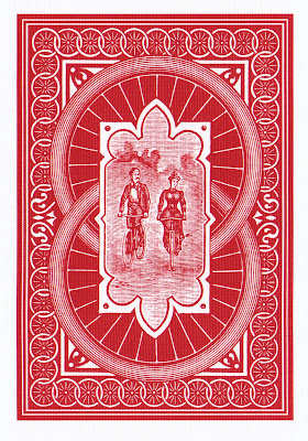
The centerpiece of the set is a reproduction of the original Bicycle cards, first produced in 1885. These are pretty widely available, but I'd never bothered to pick up a deck. The picture at the top shows you just what the first Bicycle Rider Back looked like. The bicycle implied a great deal to a late 19th century audience: freedom, travel, technology.
For the reproduction set, Bicycle even changed the card faces a bit, reducing the corner markings to their original size.
Also included is a reproduction of the original Joker, named the "Best Bower," (also known as the "Benny" or "Imperial Bower"). In Euchre, the "Best Bower" is the top-ranked trump, indicated by either the Joker or the Two of Spades.
App O' The Mornin': Rage Review
Grade: B
Price: $1
I've put off covering Rage for a couple of weeks. I kept returning to it, giving it another shot, trying a different way of playing, just to figure out if it was the game or me that wasn't quite right. I'm not sure I've figured that out yet, but I have come to this conclusion:
I really don't like it all that much.
It's certainly impressive in a number of areas, and it does something fresh with the format, but in the end I had to admit that I simply didn't enjoy it.
The Rage app is big news because it's the work of id Software, and pushes the iOS platform to its limits. Rage is id's latest series, due on multiple platforms later this year or next. The iOS version is described by John Carmack as "a little slice of Rage." I haven't seen any part of the larger game, but my understanding is that it combines driving, RPG, and FPS elements in a post-apocalyptic setting.
The "little slice" that made it to iOS is called "Mutant Bash TV," and it's a rail-shooter set in the context of a TV game show. You travel automatically through a series of twisting levels, pausing occasionally to shoot mutants and targets, as well as grab health, money, and ammo.
The rail element doesn't bother me all that much. Rail shooters can be perfectly entertaining, and Rage handles the traveling aspect fairly well. Adding movement controls wouldn't have made it a better game.
The problem is more in the controls and actual gameplay content. This is basically a shooting gallery, in which you turn around and look up or down at each stop, hunting for mutants which are closing on your position. Some throw bricks or rocks, others come in close for melee combat. You aim with one finger, and fire or dodge with the other.
But the aiming controls just seem a bit off. I tried adjusting the sensitivity levels and using different approaches, and it never quite felt right. There are awkward stages where you just can't turn and shoot fast enough, and other places where you're being attacked from a distance and have to hunt for the culprit while also fending off melee attacks. Once the mutants get in close, the screen can become so awash in blood that it's hard to even see anything.
I'm perfectly willing to admit that my mad gamer skillz may be atrophied in my old age, which is part of the reason I'm scoring the game as high as I am. It's all very slick and well-made, with plenty of content and knock-out visuals. This is clearly the product of a talented team of programmers and designers.
In the end, however, I found it all a bit unpleasant. The settings are grimy, crowded, and depressing; the pacing is jittery; and the overall effect didn't entertain me. I was glad to delete it. As I always say, however, "Your mileage may vary."